
Happy Halloween!
Since All Hallows’ Eve is upon us, I’d thought I’d have some fun with a Halloween themed post.
While your website isn’t likely to give people nightmares, the web design decisions you make can scare them away.
You don’t want to be the haunted website that all the kids avoid. You want to be the website that is known for giving the best treats.
If you’re not sure if your web design is a living nightmare, here are some clues:
Blood Sucking Vampire Email Sign-up Forms
If your email sign-up form asks visitors to complete more than three fields, you’re a certified digital vampire.
Asking visitors for their mailing address, phone number, blood type, etc. is soul-sucking. Also, none of this information is necessary for an email newsletter.
- Antidote:
Ask future subscribers for their email address and name. If you need (and will use) more information later, send out a survey to your list of subscribers.
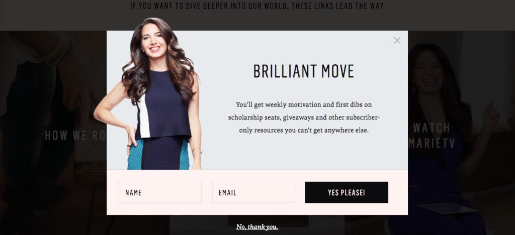
Marie Forleo (someone you should subscribe to) simply asks for a user’s name and email address.
Scary Clown Jack-in-the-Box Pop-Ups
A user lands on your web page and immediately a pop-up box jumps in their face asking them to sign up for your daily emails.
They close the box and continue scrolling down the page. Not even four seconds later a chat box pops up in the lower corner. They quickly shut down the chat to continue reading.
As they near the end, a pop-up webinar invite blocks them from reading the conclusion. By this point, they are so fed up they immediately leave your website. Leaving a comment is the furthest thing from their mind.
Congratulations. Your attempts to gather user information and engage were the equivalent of a scary clown launching out of a jack-in-the-box.
Your goals were valid, but your execution was downright obnoxious. You jarringly interrupted their experience and prevented them from absorbing the information they came for in the first place.
- Antidote:
Place your information requests, contact buttons, and webinar invites in locations that flow with the user’s experience. Yes, sometimes pop-up forms are warranted, but be scrupulous with your placement.
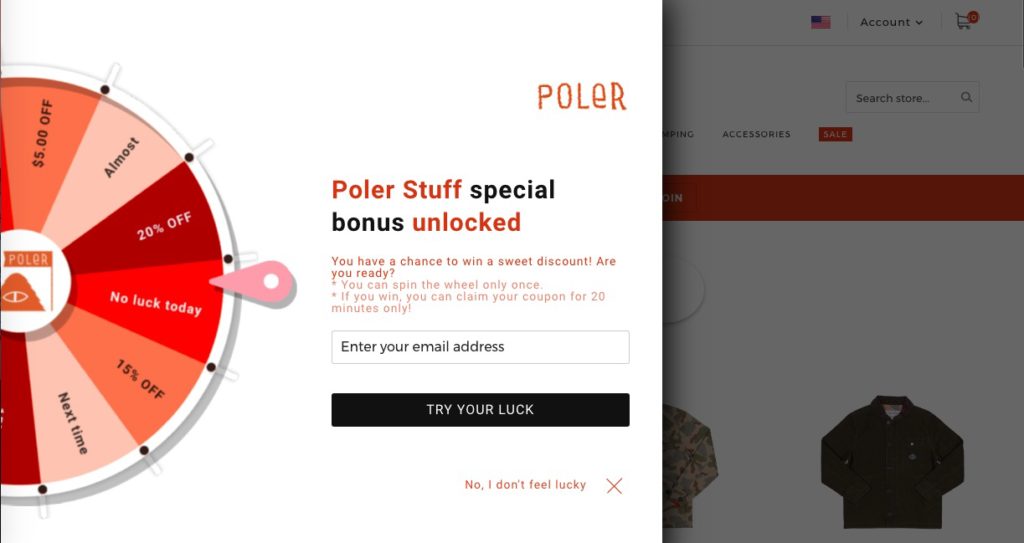
Poler’s pop-up promotion only appeared when I scrolled through a product page. After I selected “No, I don’t feel lucky,” the pop-up never made a repeat appearance even as I scrolled through other pages.
Corn Maze Navigation
Unlike a haunted corn maze, users don’t come to your site expecting to get lost (unless your site is Pinterest… then it’s expected). They come to your site with the expectation of finding what they need quickly and with ease.
Making important pages hard to find is a kiss of death – you might as well put a clown with a chainsaw in between the user and the page. A drop-down menu that disappears like a ghost is scream-inducing. A never-ending list of menu items will make anyone’s head explode.
Your navigation is essential for a user and search-friendly site that drives conversions. Digging into Google Analytics Behavior reports will give a good indication of where visitors are getting lost.
- Antidote:
Many factors impact user-flow, but a good place to initially re-evaluate is your main navigation. Integrate descriptive labels, limit the menu options to five to seven, and place it horizontally on top or vertically on the left. Following these standard practices provides a website visitors expect.
If you want to help them even more, provide them Hansel and Gretel style breadcrumbs (sans the evil witch).
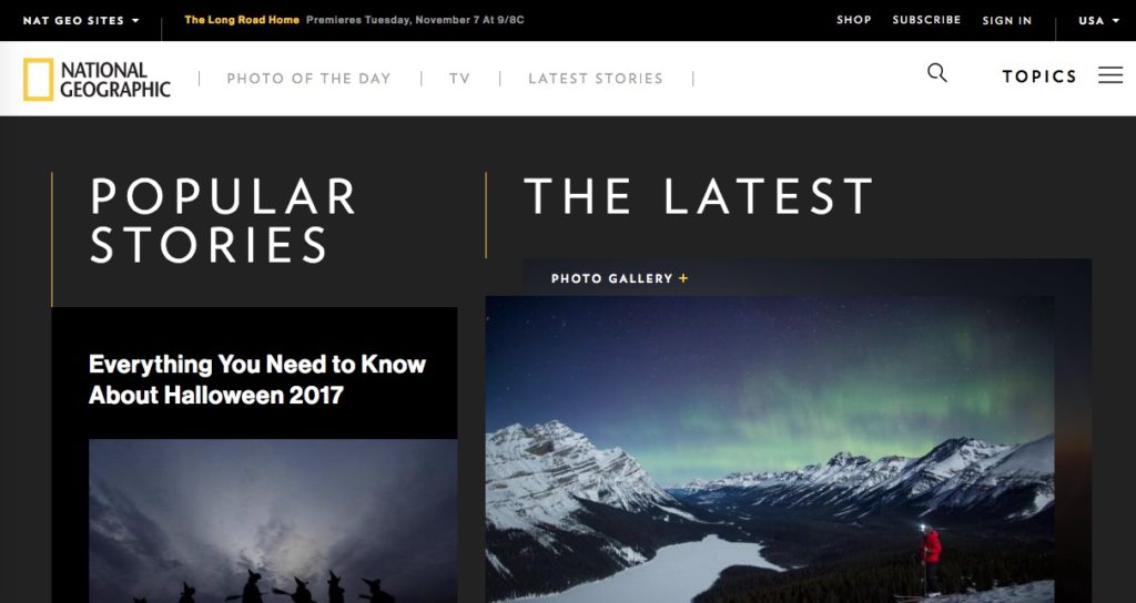
National Geographic, a content-heavy site, keeps its main navigation to three options – photo of the day, TV, and latest stories.
The Blob Monster of Web Copy
If your web pages are solid streams of text, you are the Blob Monster of Web Copy.
Your blocks of text dissolve the readability of your text. Keep in mind you aren’t writing a novel, you are writing a web page.
- Antidote
Start by breaking your text into short paragraphs, add headers, consider reformatting information into lists or bullets, and add some bolding and italics for emphasis.
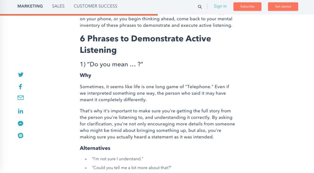
The Hubspot Blog formats their posts with readability in mind.
Don’t Be a Haunted House
You’ve spent valuable time building your business and website. Don’t squander it by making web design decisions that give visitors nightmares.
By integrating appropriately timed engagements, user-friendly navigation, simple email sign-up forms, and formatting your text, you’ll be known as the house that gives out king-size candy bars.


